Eighteen pages covering the wordmark, color, type, components, dark mode, icons, voice, and the token system that holds it all together. Everything you need to make something that looks like Launch.
CoverThe brand book, openedp. 01
ContentsThis pagep. 02
About LaunchWho we are, what we do, why this existsp. 03
Brand DNAFour shapes, four colors, one squarep. 04
LogoWordmark, icon, clear space, usagep. 05
Color · PrimariesFive hues with hex, tonal companions, rulesp. 06
Color · Surfaces & intentThree canvases; semantic role > raw hexp. 07
Typography · FamiliesPP Formula and its supporting handsp. 08
The token systemWhat it is, why we use it, how it worksp. 13
VoicePlainspoken and confident; do's and don'tsp. 14
PhotographyReal people, real shops, brand drawn on topp. 15
Companion brandsLMC, Launch Learning, and what comes nextp. 16
ColophonHow to reach us, what to ask forp. 17
Launch Industries · Brand Kit · 202602
Launch Industries · LIDS03 · About
03 · About Launch
A Seattle social enterprise, built for small-business operators
Launch Industries was founded in 2022 to take the back-office work off small-business and nonprofit owners, so they can spend their time on the floor, with their people, running the thing they came to run.
We're a social enterprise. We measure success by whether people enjoy their jobs and their companies, and by whether conditions let them make the difference they're out to make. People, the Planet, and (then) Profit, never profit at the expense of the other two.
Direct Client Services. Back-office work delivered to operators who come to us directly: bookkeeping, payroll, HR, startup support, tech automation, marketing. Most small businesses can't afford a CFO, a head of HR, and a marketing lead — but they can afford one partner who handles all of it.
Technical Assistance Programs. Free consulting delivered under public-sector partnerships. Cities and counties fund the work, we deliver it; same playbook, no cost to the operator who qualifies.
DBE, WBE, and Micro-certified. The certifications signal who we are: a small, woman-owned business helping other small businesses do the work.
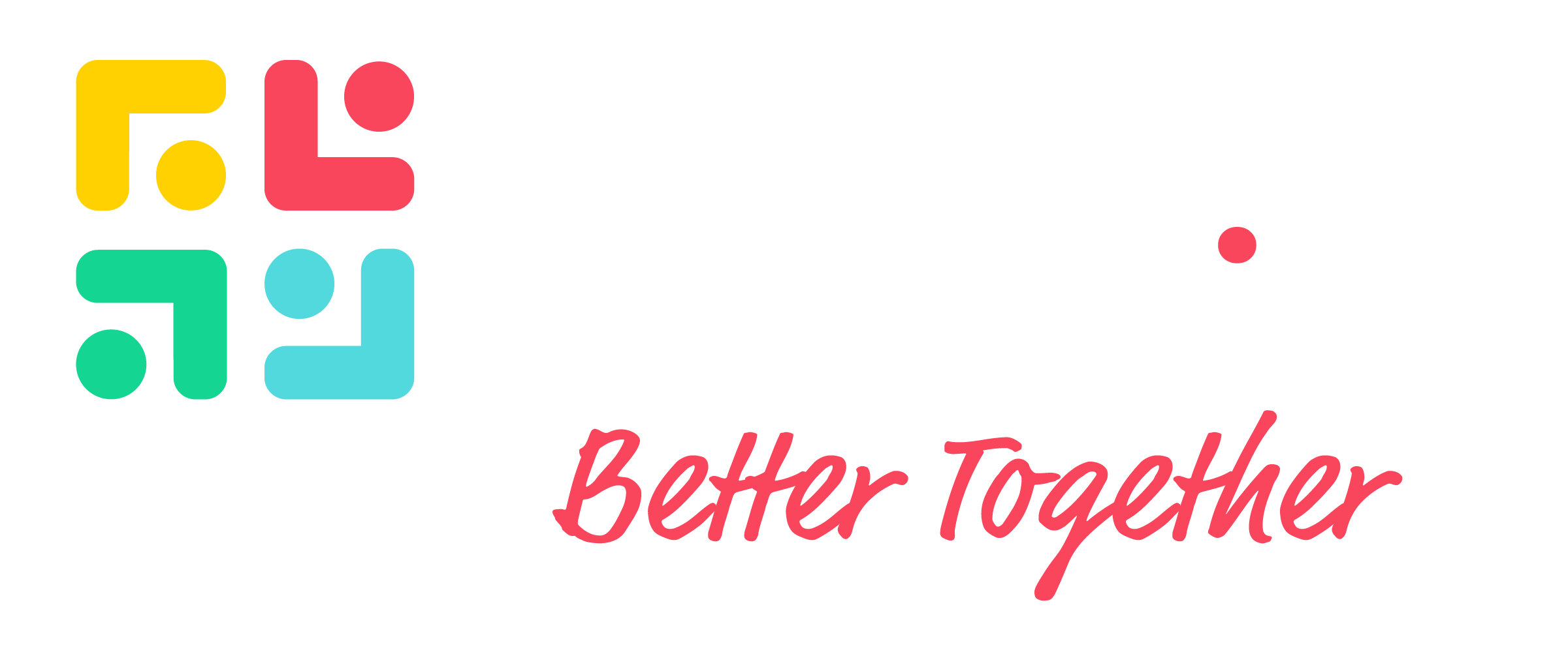
Better together
Not decoration. How the work runs — your team and ours, side by side, building the kind of company you'd want to work at.
02.2 · What we do
01Startup support
02Bookkeeping
03Finance
04Payroll & benefits
05Human resources
06Operations consulting
07Organization development
08Technology & automation
09Marketing
10Websites
11Washington registered agent
Where we are
4136 California Ave SW #2
Seattle, WA 98116
(206) 552-0380 · hello@launchindustries.biz
DBEWBEMicro
Launch Industries · Brand Kit · 202603
Launch Industries · LIDS04 · Brand DNA
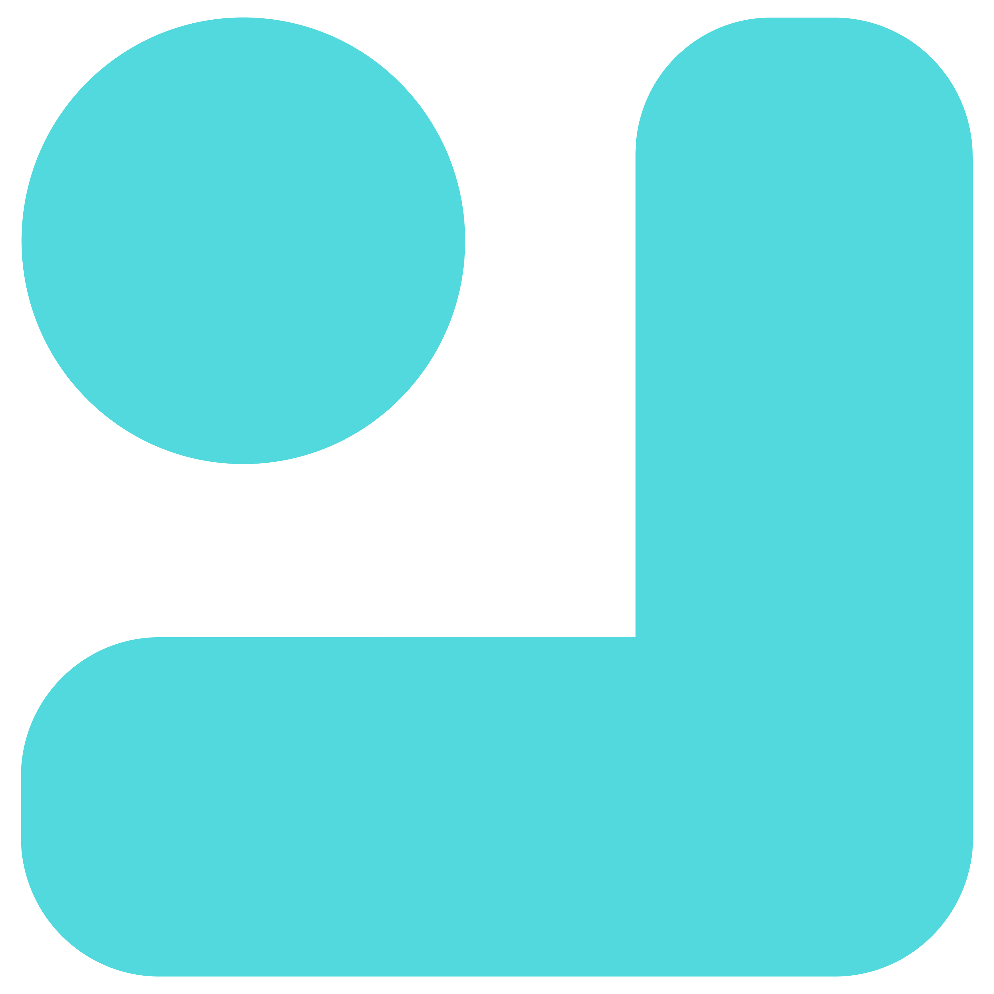
04 · Brand DNA
Four shapes, four colors, one square
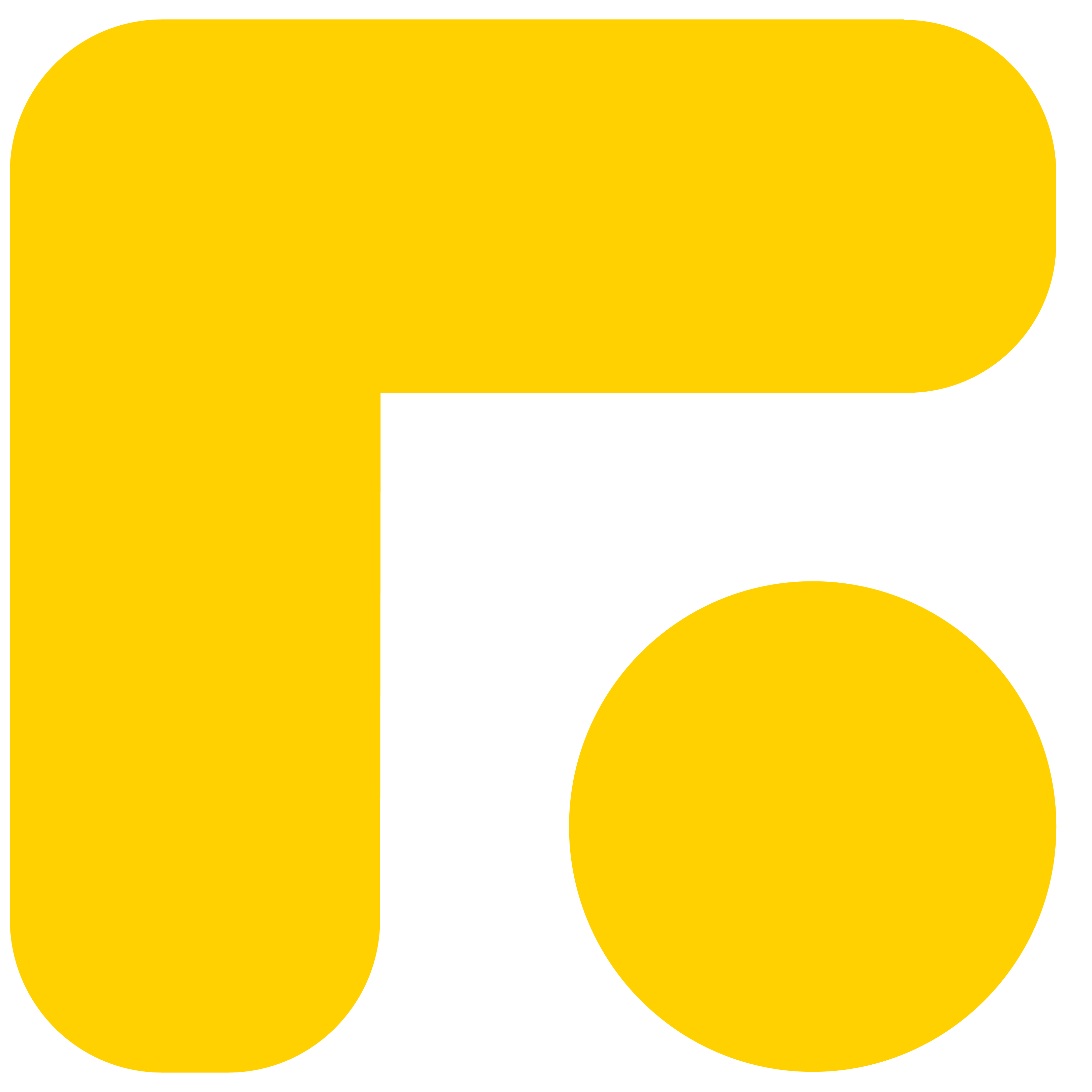
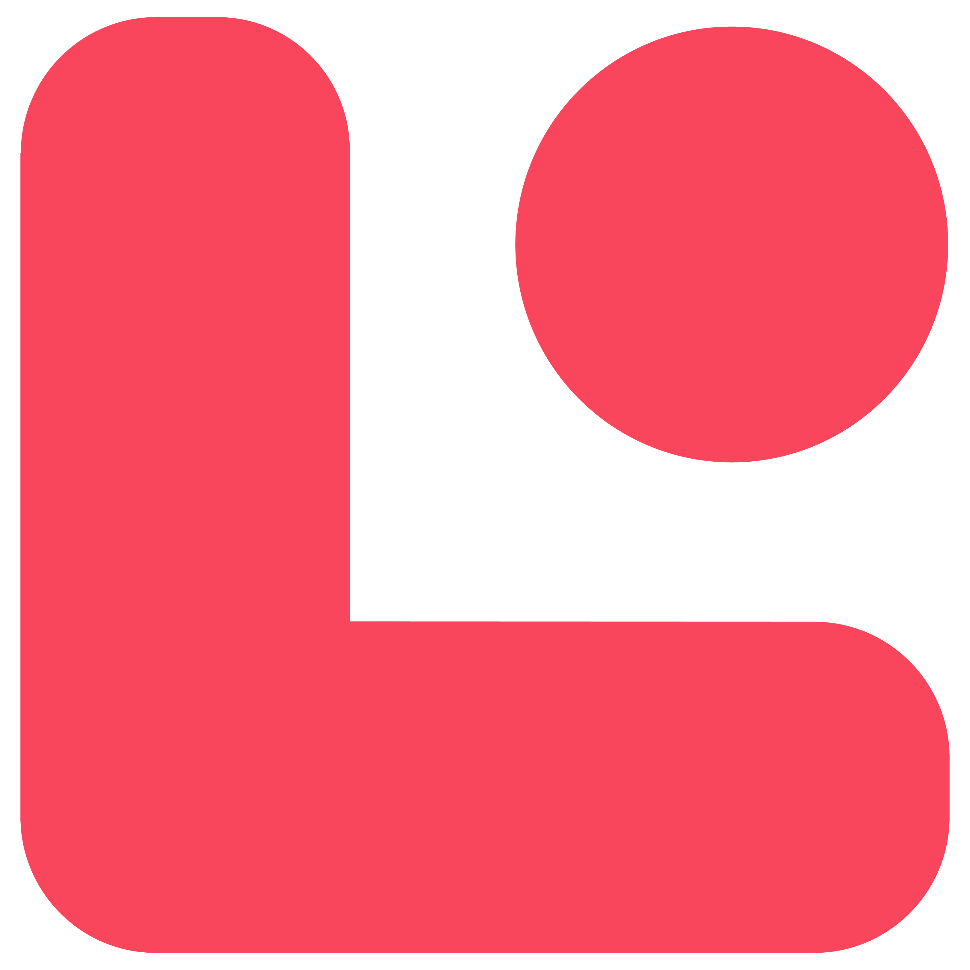
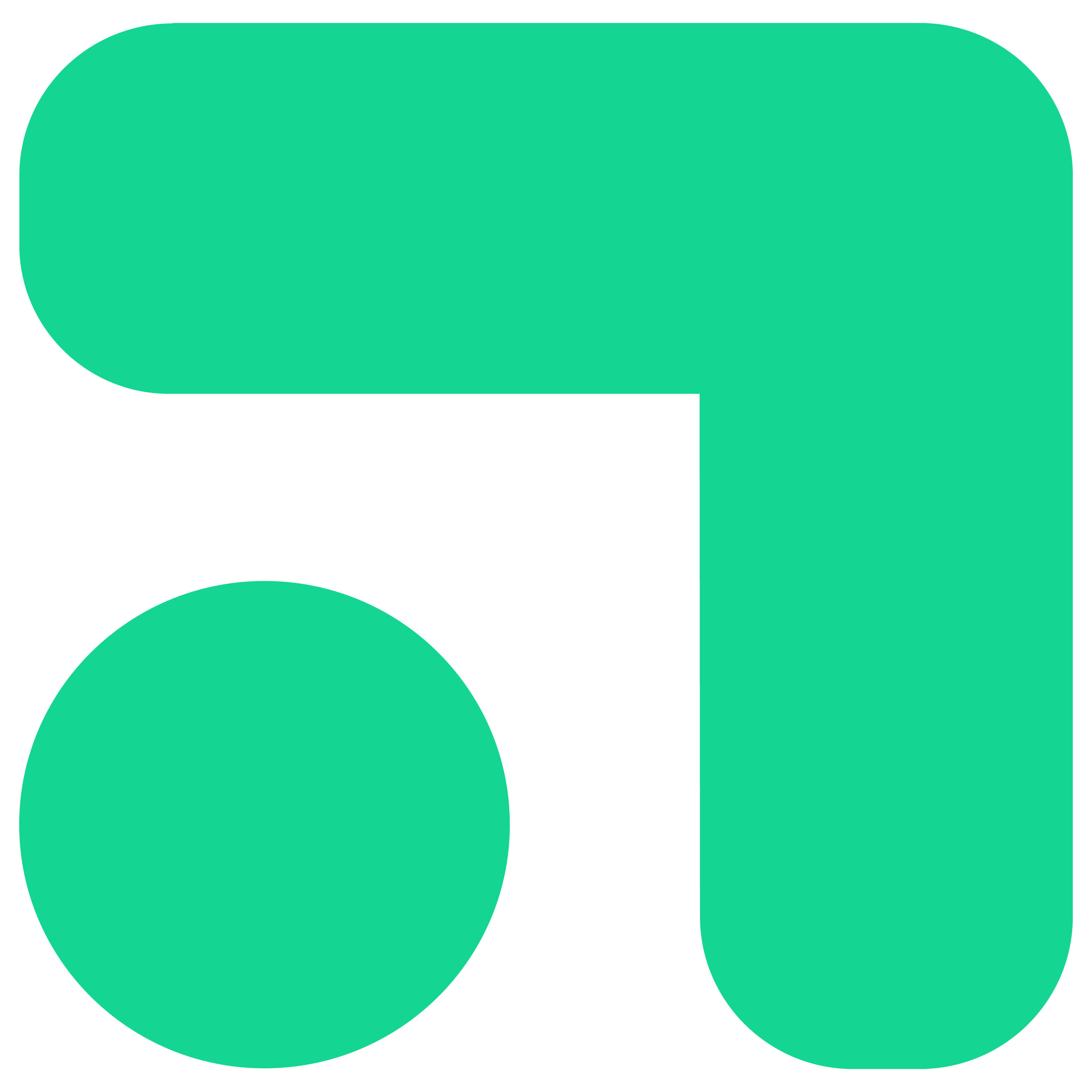
The icon is a 2×2 quadrant of corner-bracket-and-dot shapes — yellow, red, green, teal — locked to position. It reads as parts that combine into a system. The wordmark stacks "Launch / Industries" in a heavy industrial sans, with one load-bearing detail: the red tittle on the lowercase i.
Spark — top-left, yellow
The starting energy. The reason small operators light the thing up in the first place.
Signal — top-right, red
The one critical thing. Carries the red tittle in the wordmark and the dot in the tagline.
Growth — bottom-left, green
Go, success, money-up. Where the work pays off.
Clarity — bottom-right, teal
Information, calm, the cool head. What it feels like when the back office is handled.
04.A · Position is fixed
Quadrants don't move
Yellow top-left, red top-right, green bottom-left, teal bottom-right. The icon never rotates and the colors don't swap.
04.B · All four — only in the mark
Pick one or two outside the icon
The icon is the only place all four colors appear together. On every other surface, choose one or two plus ink and paper.
04.C · The red dot is load-bearing
One signal moment per page
The red tittle on the i, the dot after "together," the divider beside an eyebrow — one critical red moment per surface.
Launch Industries · Brand Kit · 202604
Launch Industries · LIDS05 · Logo
05 · Logo
The wordmark, with room to breathe
Clear space is the height of the lowercase n in Launch on every side. Minimum size: wordmark 120px wide, icon 24px square. Use the white version on dark surfaces.
05.1 · On light
05.2 · On dark
Clear space
The height of the lowercase n in Launch, on every side. Nothing crowds the mark.
Minimum size
Wordmark: 120 px or 1 in wide. Icon-only: 24 px or 0.25 in square.
Don't
Don't recolor, stretch, outline, gradient, drop-shadow, or rotate. Don't separate the red tittle from the i.
Launch Industries · Brand Kit · 202605
Launch Industries · LIDS06 · Color · Primaries
06 · Color · Primaries
Five hues, one rule
Yellow, red, green, and teal are sampled from the icon mark. Never use all four together outside the logo — pick one or two per surface, plus ink and paper. Collaboration blue is the 5th hue, outside the icon palette: a bold accent we reach for when something needs extra oomph.
06.1 · Spark#FFD100
Spark yellow --li-yellow
Default accent. Energy. The "launch" hue.
100 / 500 / 700
06.2 · Signal#F9465C
Signal red --li-red
The red dot. One critical thing per surface.
100 / 500 / 700
06.3 · Growth#14D592
Growth green --li-green
Go, success, money-up.
100 / 500 / 700
06.4 · Clarity#51D9DD
Clarity teal --li-teal
Information, calm states, secondary highlights.
100 / 500 / 700
06.5 · Oomph#2D4DFF
Collaboration blue --li-blue
Outside the four-quadrant icon palette. A 5th color we reach for when something needs extra punch — a hero accent on a non-yellow surface, a stand-out CTA, an emphasis pill. Use it sparingly; never in the icon mark.
100 / 500 / 700
Launch Industries · Brand Kit · 202606
Launch Industries · LIDS07 · Color · Surfaces & intent
07 · Surfaces & semantic intent
Three canvases. Roles, not hex.
Pure white for product UI. Warm paper for marketing and editorial. Ink for the one full-bleed dark moment per page. In product code, reach for the semantic name — not the raw hex.
DangerThe signal · the load-bearing redErrors, destructive actions--intent-danger
InfoCalm states · supporting highlightsTooltips, neutral notices--intent-info
Neutrals — warm-cool ink
1000
900
800
700
600
500
400
300
200
150
100
050
Launch Industries · Brand Kit · 202607
Launch Industries · LIDS08 · Type · Families
08 · Typography · Families
PP Formula, plus the supporting hands
PP Formula carries the workhorse load — sixteen cuts cover everything from eyebrows to display. Two hand-drawn faces sit alongside it for the brand's one playful word per surface: Market Pro for the canonical "together" lockup, Permanent Marker for everything else. Instrument Sans is the documentary substitute where PP Formula can't go.
08.1 · Primary face · 16 cuts
PP Formula
Build, ship, run a small business
Geometric, slightly industrial, with great heavy weights. Extrabold for headlines, Regular for body, Narrow Semibold for eyebrows.
08.2 · Display · extreme condensed
PP Formula Compressed
Better together
Reserved for big display moments — hero headlines, posters, slide titles. Black weight only.
08.3 · Brand-signature script
Market Pro
together
Use Market Pro only for the canonical "together" lockup — the brand's most expressive moment. Its character pairs are tuned for that single word; don't reach for it on others.
08.4 · Alternate hand
Permanent Marker
Launch · joy · build
Use Permanent Marker for any other casual, hand-drawn word — especially pairs Market Pro can't render cleanly (notably u/n, u/m, like in "Launch"). One per surface. Shared across our sister brands.
08.5 · Documentary face · where PP Formula can't go
Instrument Sans
Build, ship, run a small business
Use Instrument Sans wherever PP Formula can't go — Google Docs, Sheets, Slides, embedded forms, contracts, anything we don't fully control. Free from Google Fonts, shares the geometric posture of PP Formula, reads as our voice without forcing a font upload.
Launch Industries · Brand Kit · 202608
Launch Industries · LIDS09 · Type · Hierarchy
09 · Typography · Hierarchy
Three weights carry the page
Extrabold for headlines, Regular for body, Narrow Semibold for eyebrows. Don't reach for a fifth weight.
DisplayPP Formula Extrabold112 / 1.04 / -0.02em--fs-112 · --font-display
Launch the next thing
H1PP Formula Extrabold64 / 1.04--fs-64 · --font-sans
A studio for builders
H3PP Formula Extrabold28 / 1.18--fs-28 · --font-sans
What we make
EyebrowPP Formula Narrow Semibold13 / +0.12em / UPPER--fs-13 · --font-narrow
Featured · Spring 2026
LedePP Formula Light20 / 1.65--fs-20 · --font-sans
A studio for people who'd rather build than wait. We take the back-office work off small-business operators.
BodyPP Formula Regular16 / 1.5--fs-16 · --font-sans
Launch Industries is a Seattle-based small-business consulting social enterprise, founded 2022. We take the back-office work off small-business and nonprofit operators so they can run their businesses.
QuoteMarket Pro Regular24–40 / 1.18--font-script
Better together
Launch Industries · Brand Kit · 202609
Launch Industries · LIDS10 · Components
10 · Components
Buttons, badges, cards, inputs
A small kit of confident, geometric components built from the tokens. Black for primary actions; yellow for the one moment per page that deserves a punch.
Buttons
10.1
On hover: Primary lifts and shifts to --ink-700. Accent deepens to --li-yellow-700 and the red glow grows. Outline fills in to black. Ghost picks up an --ink-100 wash.
Badges
10.2
ActiveFeaturedInfoAction needed
Mostly black-and-paper with one small brand-color status mark. The system reads as Launch before it reads as generic UI.
Service card
10.3
— 03
Bookkeeping
Clean books, on time, every month. We pick up the close so you can stay on the floor.
Focus uses a 2px yellow outline with 2px offset. Never remove focus.
Launch Industries · Brand Kit · 202610
Launch Industries · LIDS11 · Dark mode
11 · Dark mode
When the room goes dark
Same components, dark canvas. Page background is --ink-1000; raised surfaces use --ink-900; borders use --ink-700. The components flip; the rules don't.
Logo on dark
11.1
On dark, always use the color shapes with white lettering variant. The quadrant colors stay vibrant; the wordmark stays legible.
Surface scale
11.2
Page--ink-1000 · #0A0C10
Raised--ink-900 · #14171D
Overlay--ink-800 · #1F242C
Border--ink-700 · #353C47
Four-step ladder: page → raised card → overlay → border. Don't go lighter than 700 for borders.
Buttons on dark
11.3
Primary inverts to white-on-ink. Yellow accent still carries the once-per-page punch. Outline becomes a white hairline.
Card on dark
11.4
— 05
HR & people ops
Hiring, onboarding, handbook, performance — the people work that keeps a team running.
Surface flips to --ink-900 with a 1px --ink-700 hairline. Brand-color icon tiles stay full saturation.
Badges on dark
11.5
DefaultActiveFeaturedInfoAction
Tonal -100 fills already pop on dark — no recolor needed. Default badge swaps to ink-800 so it still reads as a neutral chip.
Brand colors on dark
11.6
FFD100
F9465C
14D592
51D9DD
2D4DFF
All five hues hold saturation against dark — no recolor for accessibility. Yellow / green / teal carry ink text; red and blue carry white.
Launch Industries · Brand Kit · 202611
Launch Industries · LIDS12 · Icons & spacing
12 · Spacing & iconography
A 4-pt grid and Lucide
Every spacing token is a multiple of 4. No off-grid values. Icons are stroke-only Lucide at 1.75px, sized 20 in body, 24 in nav.
Spacing scale
sp-1 · 4
sp-2 · 8
sp-4 · 16
sp-6 · 24
sp-8 · 32
sp-12 · 48
sp-16 · 64
sp-24 · 96
Marquee icon tiles
For feature illustrations, drop a Lucide icon into a 64px brand-color square at --r-12 radius. White icon on red and blue; ink icon on yellow, green, teal.
Library starter set
Lucide icons sit in currentColor — the canvas sets the hue. Use sparingly; one per card, one per nav item.
rocket
calculator
users
briefcase
trending-up
megaphone
zap
handshake
check
arrow-right
star
sparkles
leaf
store
building-2
message
Launch Industries · Brand Kit · 202612
Launch Industries · LIDS13 · The token system
13 · The token system
One source of truth, everywhere we build
A design token is a named decision — "primary action color is ink-1000" — saved as a CSS variable instead of a raw hex. Every Launch surface (website, portal, decks, emails) imports the same token file. Change a token in one place; the whole system updates. That's why everything feels like it belongs to the same brand.
The token file is the brand
The canonical token file is colors_and_type.css. It declares every brand color, font, weight, spacing step, radius, shadow, and easing curve as a CSS custom property. Anything that's about to enter the brand starts there.
Hex codes, pixel sizes, font files. Defined once, never inlined into a component.
--li-yellow: #ffd100;
Layer 02 · Semantic
Role-named aliases
What the primitive is for. Survives theme changes; primitives don't.
--intent-accent: var(--li-yellow);
Layer 03 · Component
What you actually use
Components reach for the semantic name, never the primitive. Swap a theme without touching code.
.btn-accent { background: var(--intent-accent); }
The rule
Docolor: var(--intent-success);
Reach for the semantic role. If we re-theme later (high-contrast, a sub-brand, dark mode) the role still works.
Don'tcolor: #14d592;
Inlining the hex skips the system. The next person can't tell which green this is, or what it means.
Launch Industries · Brand Kit · 202613
Launch Industries · LIDS14 · Voice
14 · Voice
Plainspoken and confident
Sentence case. "You" first, "we" second. Optimistic without being precious. A wink, not a joke. One small playful detail per surface — not a stand-up routine.
DoSounds like Launch
"Better together."
"Nothing here yet. Start something."
"That didn't go through. Try again, or tell us what broke."
"12 ventures. One studio."
"Build, launch, ship, run, make."
Don'tDoesn't sound like Launch
"Empowering world-class solutions."
"Ready to launch?" headlines aren't questions
"Synergize, leverage, ideate, unlock."
"Fast, simple, beautiful, modern" pick one
Emoji on any polished surface.
11.A
Sentence case
Headlines, buttons, labels. Title case feels like a memo from a bank.
11.B
You first
"Your books," "you'll get a draft." We come second.
11.C
One detail
One Market Pro word, one red dot, one playful aside per surface.
11.D
Pick one
"Fast, simple, beautiful, modern" is four promises and a stack of nothing. Choose.
Launch Industries · Brand Kit · 202614
Launch Industries · LIDS15 · Photography
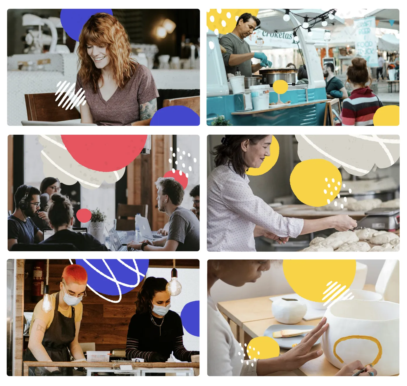
15 · Photography
Real people, real shops, with the brand drawn over the top
Launch's photography is a collage system — real workplace photos with brand-color blobs, dots, and hand-drawn marks layered on top. Subjects are real Seattle small-business operators, not stock. Daylight, real desks, real shops. The shapes do the brand work; the photo does the truth-telling.
Real expression · brand ground
Operators · yellow
Shapes layered in
Real, not stock
Actual operators in actual rooms. Daylight when possible. No corporate handshakes, no white-cube product shots.
One ground per image
Yellow, red, green, or teal as the saturated background. The image gets one — not all four.
Shapes do the brand work
Brand-color blobs, dots, and the four icon shapes layer on top. The photo carries the truth; the shapes carry the brand.
Launch Industries · Brand Kit · 202615
Launch Industries · LIDS16 · Companion brands
16 · Companion brands
Built under one roof, one name
Anything Launch builds carries "Launch" in the name — it's how operators know it's part of the family. Each companion gets its own design system that inherits the LIDS foundations (type, spacing, voice) while taking on its own color and personality.
16.1 · Sister brand · Live
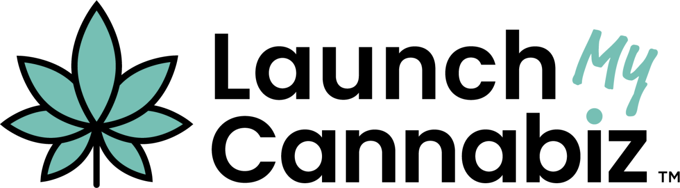
LaunchMyCannabiz
The cannabis-operator arm. Same back-office playbook, industry-specific compliance and language. Teal cannabis-leaf mark; "My" in shared Permanent Marker — the connective hand across the family.
16.2 · Sister brand · Live
Launch Learning
The education arm — courses, workshops, curriculum. Book mark in collaboration blue with a yellow + teal "L" inside, and the load-bearing red dot carries over to the i in Learning.
Launch ___Your next companion brand
16.3 · Naming rule
Carries "Launch" in the name
Every companion brand begins with or contains Launch. The shared name is how the family stays legible to operators and to the certifications we hold.
Launch Industries · Brand Kit · 202616
Launch Industries · LIDS17 · Colophon
17 · Colophon
Use it. Bend it. Ask us.
This kit is the print-companion to the live design system at lids.launchindustries.biz, where every component, token, and asset can be copied directly. When in doubt, the live site is the source of truth; this PDF is the field reference.
Live system
lids.launchindustries.biz
The canonical, always-current design system. Tokens, components, motion specs, and downloadable assets.
Questions, requests, exceptions
hello@launchindustries.biz
(206) 552-0380
For asset requests, brand reviews, or a companion-brand kick-off.
Files
Fonts, logos, color swatches, and photo treatments live in the LIDS site's assets directory.
Companions
LaunchMyCannabiz · brand-lmc.vercel.app
Launch Learning · coming
Launch Industries · Brand Kit · 202617
lids.launchindustries.biz · Edition 2026.05 Built in Seattle by Launch Industries LLC. Updated as the brand grows.